Thursday, December 15, 2011

Studio Lighting--7


This one is unique because of it's sort of
sillouette vibe.

Another sort of dark, sillouette..but
more of a dramatic lighting picture.

I like this photo because of it's sort of subtle vibe and the dramatic lighting is great.

studio_lighting01.jpg

Great dramatic lighting, you can see the light is being shined directly on her which makes for great effect.
photography_tutorial_studio_lighting-11.jpg

Another cool studio lighting, and also motion. I like this one because of the water at the top, someone has clearly just set it down and dramtic lighting gives it an even cooler effect.

Tuesday, November 29, 2011

Realistic/Ambigous Portraits--6


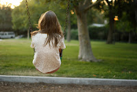
This is a great picutre for realistic/ambigous portraits because
the child has no clue the picture is being taken, and theres a slight
rule of thirds being used.

This is a cool ambigous portrait, that looks like it was taken from either a balcony
or a higher level surface. The women doesnt appear to have any idea the photo is being taken.
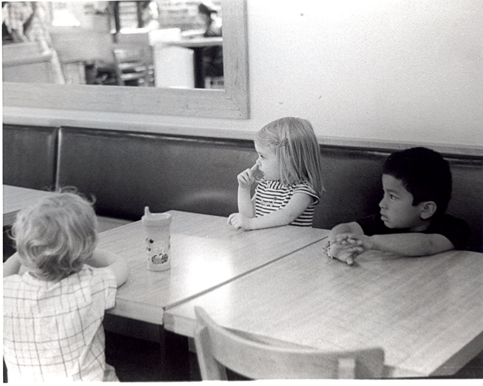

This is a great photo, because the kids have no idea whats going on. Kids are great to photograph because alot of the times theyre doing their own thing and its easy to catch them in the moment.


This sorta looks like it might be posed, however it was on a website for realistic and
ambigous photos. So, this could very be a picture caught in the moment.
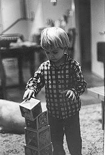

This doesnt look posed at all because the
child is focusing on the blocks and doesnt know the picture is being taken.

                                                      These are my Realistic/Ambigous Portraits:


These arn't the best photos I've ever taken, but I do like the idea behind them. I think even if the picture itself isnt great, I like where it was coming from. The first one I like, because my Aunt and my brother have no idea iam taking the photograph, and they're being framed by a column and a china shelf.  I think I my use of postive and negative space was ok....there was good contrast for the most part. What makes this photo look real is that they have no clue that I am taking the picture.
My second photograph, I like this one because of all the layers; the table, silverwear, a glass, my grandmother, and her friend, and then my uncles in the backround. And, once again they have no clue this picture was being taken.  My use of positive and negative space was once again okay...not alot of contrast..sorta gray. But, what makes this photograph look real is the fact that there are two conversations going on and neither of the two realize that a picture is being taken.

Monday, November 21, 2011

David Hockney--5

In order to create a David Hockney style photo for the hallway, lighting is important because just like for every othere photo, you want contrast, and good lighting. Meaning, you read your light meter accordingly and adjust and overexpose and underexpose when nessasary. A good subject for this type of photo can be really anything, but in my opinion, buildings, landscanpes and scenories work best!

Carter's Mountain Field Trip--4

Overall, I thought my Carters Mountain roll was OK. Wasn't the best roll I've ever taken, however there were a few good photos I had to work with. My two prints that I turned in were portraits, they turned out alright. If they had been more focused and I had used the roll of thirds they might have been a little better. I'd say both of my photos rated a 4, because they weren't terrible, but blurryness takes alot away from a photograph.

Positive Polaroid Lift off--3


I think a simple subject works best for the positive polaroid lift offs. Because, if you have a really complex photo it might be hard to see it. Also, a photo with a lot of contrast works best, and thats not too dark and not too light.
Overall, I liked my positive polaroid lift off prints. I did a picture of my goat, and a graphitti wall-which worked pretty well because of the contrast between the writing and the white wall.

Thursday, November 17, 2011

Sepia Toning--2


As you can tell by the above photos you can use just about any photo for sepia toning. I like lancapes, scenories, and people particularly for sepia toning. I like the way my first sepia toning print turned it. It was a picture of a graphiti wall with the words "WOW" with the 'O" made out of a drain pipe in that wall with leaves coming out. I liked the browns and I really liked the subject. The second photo I did, I took a picture of more graphiti, but I didnt like the way my second one turned out as much as my first.

Thursday, November 10, 2011

Norman Parkinson Fashion Photographer--1


I really like Norman Parkinson's photos for a a couple reasons. I like the subjects, and how he's soley into photographing women and fashion design. His photos are unique and abstract, similar in ways...very different in others. Alot of times you can't even tell what's going on in the photo which I think is cool because it means that It probably meant something to the photographer. And, also..it's probably just a unique way he has the models pose. I really like the photographs he takes.